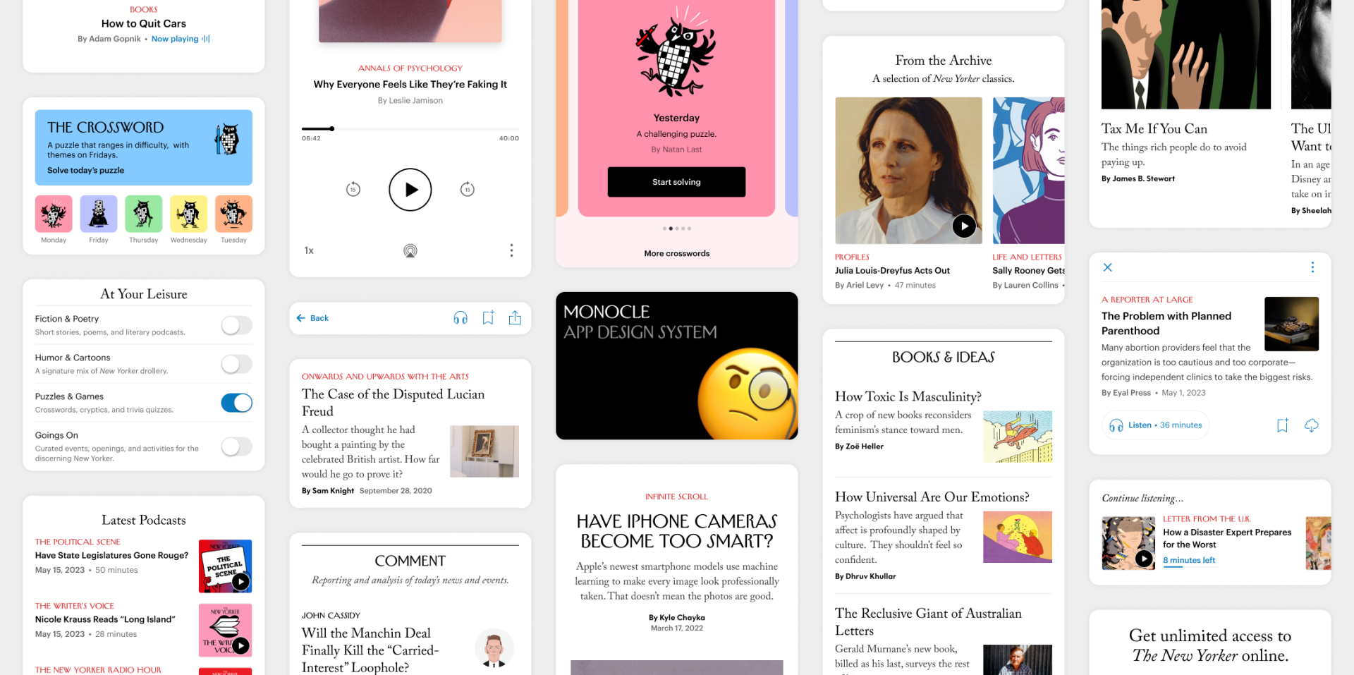
WORK / DESIGN SYSTEM
Project summary 🗒️
OBJECTIVE
Increase efficiency and consistency within the app and between the iOS and Android platforms. This better enables our apps to support user-centered features such as dynamic text sizing and dark mode.
RESPONSIBILITIES
I led the design system initiative, developing the framework and strategy in close collaboration with our lead iOS and Android engineers. Subsequently, I independently built and maintained the design system Figma file, utilizing Figma's tools and structure to support tokens, smart components, and variables.
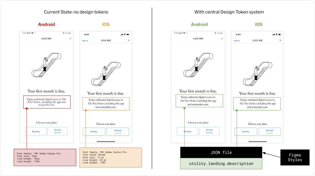
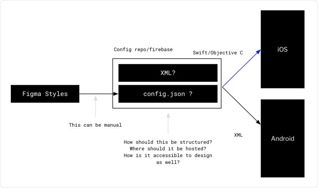
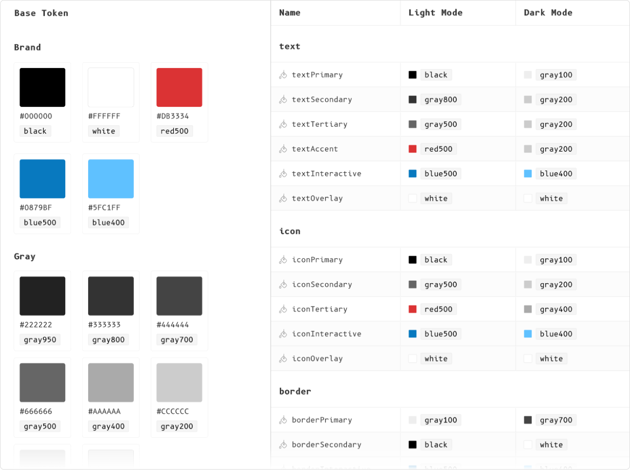
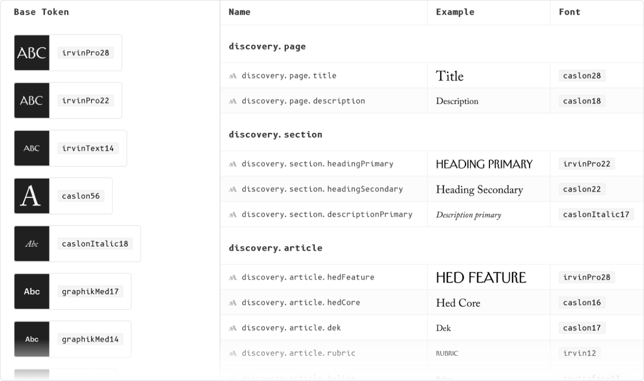
I crafted base and semantic tokens for color and font styles aligning with both platforms, enabling iOS and Android engineers to pull styles through a shared JSON file.
WINS
The implementation of color and font tokens resulted in reduced time for engineers to build new components, streamlined design walkthroughs, minimized VQA efforts, and enhanced codebase consistency and cleanliness.
THE PROBLEM
Lack of shared documentation between iOS and Android engineering teams and the absence of a token-based system leads to an inefficient, manual coding process that is prone to human error.
HYPOTHESIS
Creating a design system that is simple, scalable, and understandable by both designers and engineers will shorten design and development time, reduce errors in styles, and expedite the development and launch of new features.
COLLABORATION
I collaborated directly with iOS and Android engineers to ensure alignment, all perspectives were heard and understood. This allowed me to develop an approach that was accepted and maintained by all stakeholders.
Design systems research 👩🏼💻
Drawing on my experience with Condé Nast's global design systems, I leveraged the open-source information on Material 3 Design Systems (Android) and Human Interface Guidelines (iOS) to inform my strategy in developing The New Yorker’s app design system.
I developed multiple naming conventions for the semantic tokens. Ultimately, with stakeholder input and guidance, I defined a model that aligned with the global design framework already in place for the web platforms at Condé Nast. This ensured universal understanding among all designers and engineers at the company.
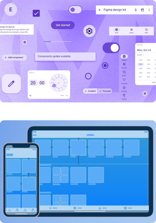
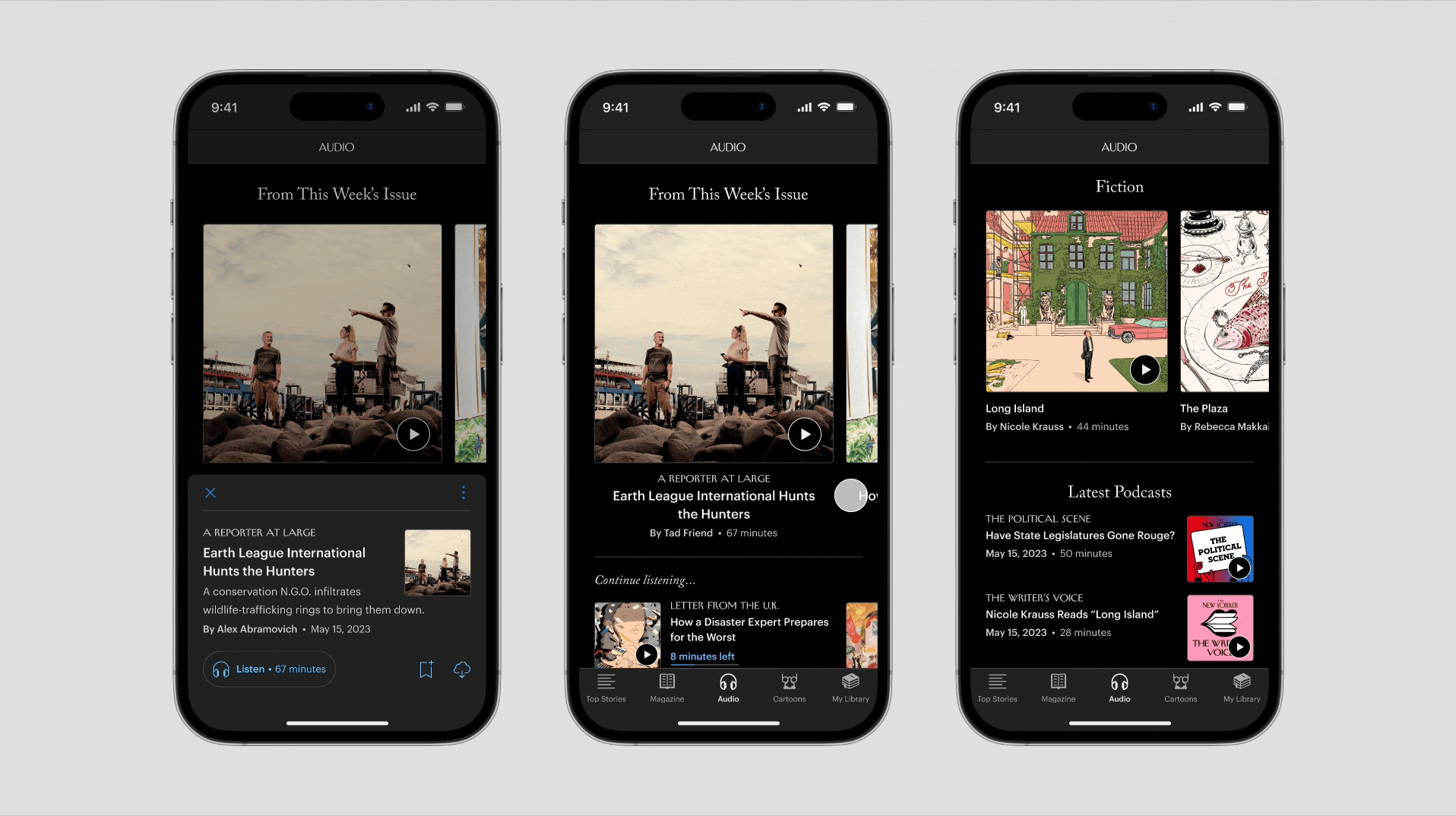
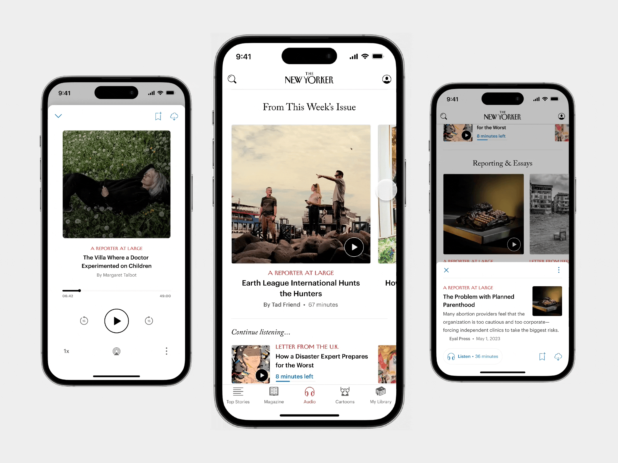
Monocle, App Design System 🧐
Monocle serves as the single source of truth for designers on the native apps team, with engineers pulling JSON files directly. Beyond font and color styles, this file comprehensively lists product features for each app, ensuring up-to-date information and linking out to detailed project files.
Simplified component management and centralized documentation significantly facilitated the development and maintenance of existing and new features.
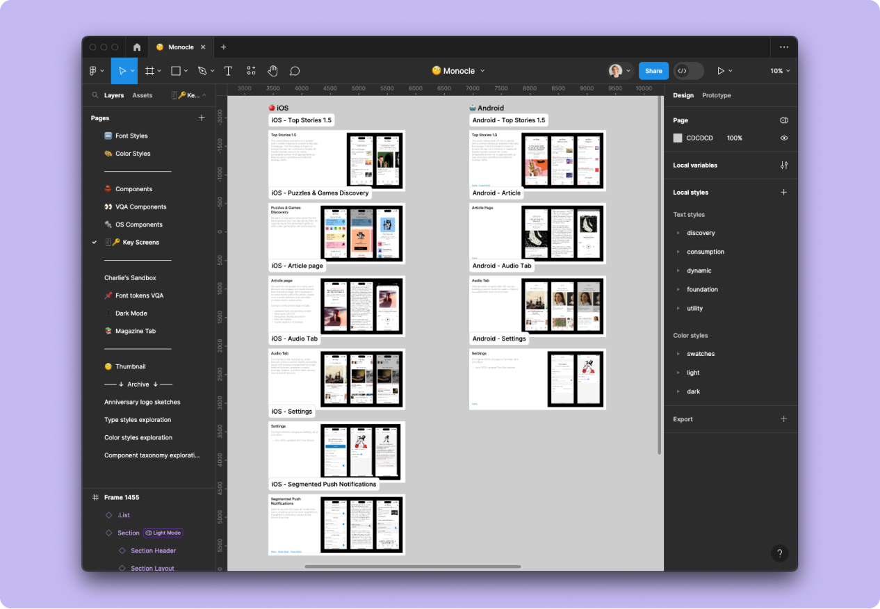
MONOCLE
Sample of color and font tokens
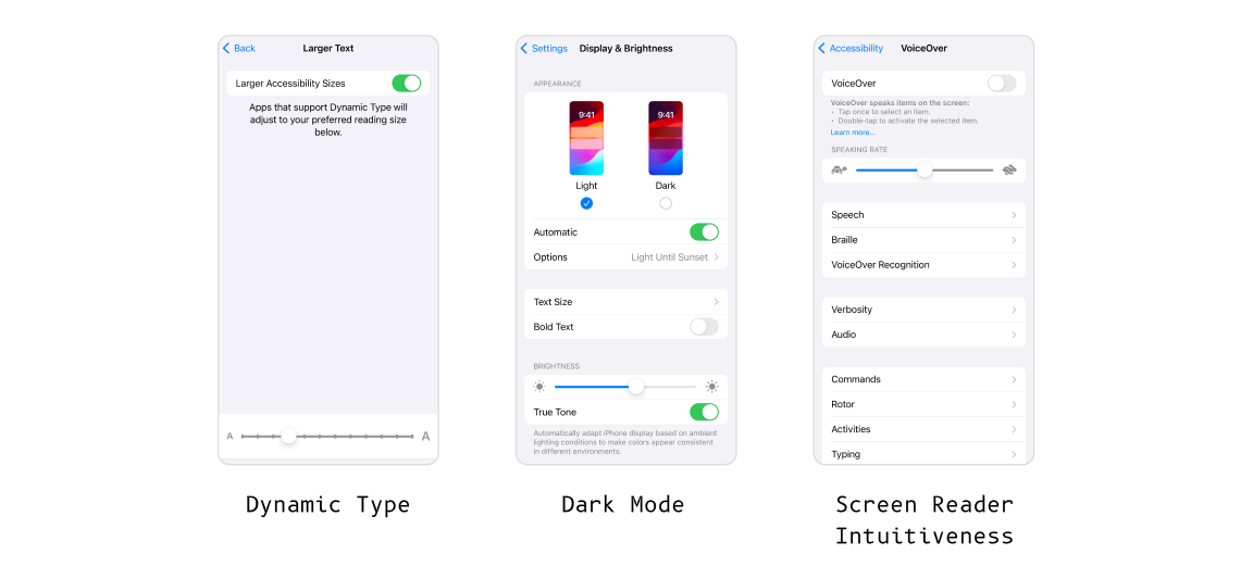
USER-FACING ISSUES
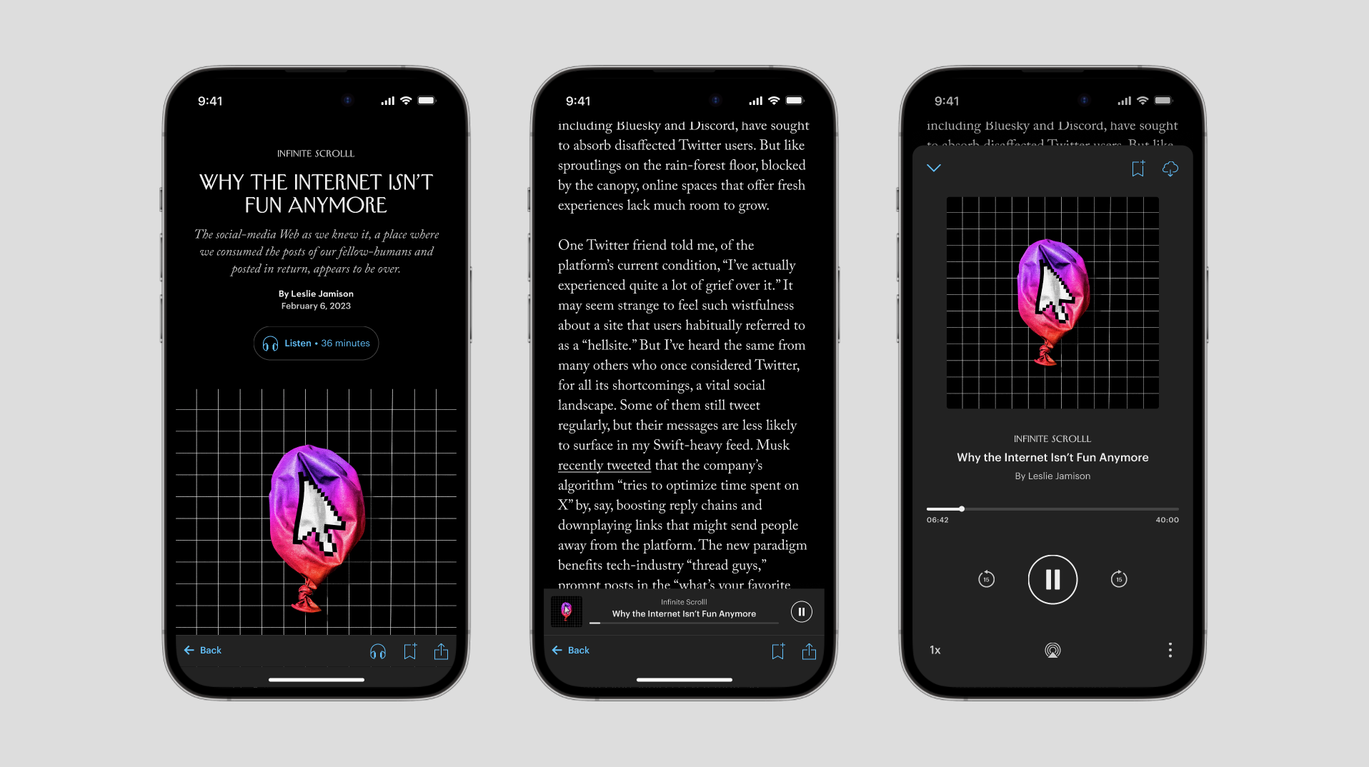
With a design system in place we can effortlessly implement accessibility features like dynamic type, color contrast, dark mode, and screen reader capabilities.
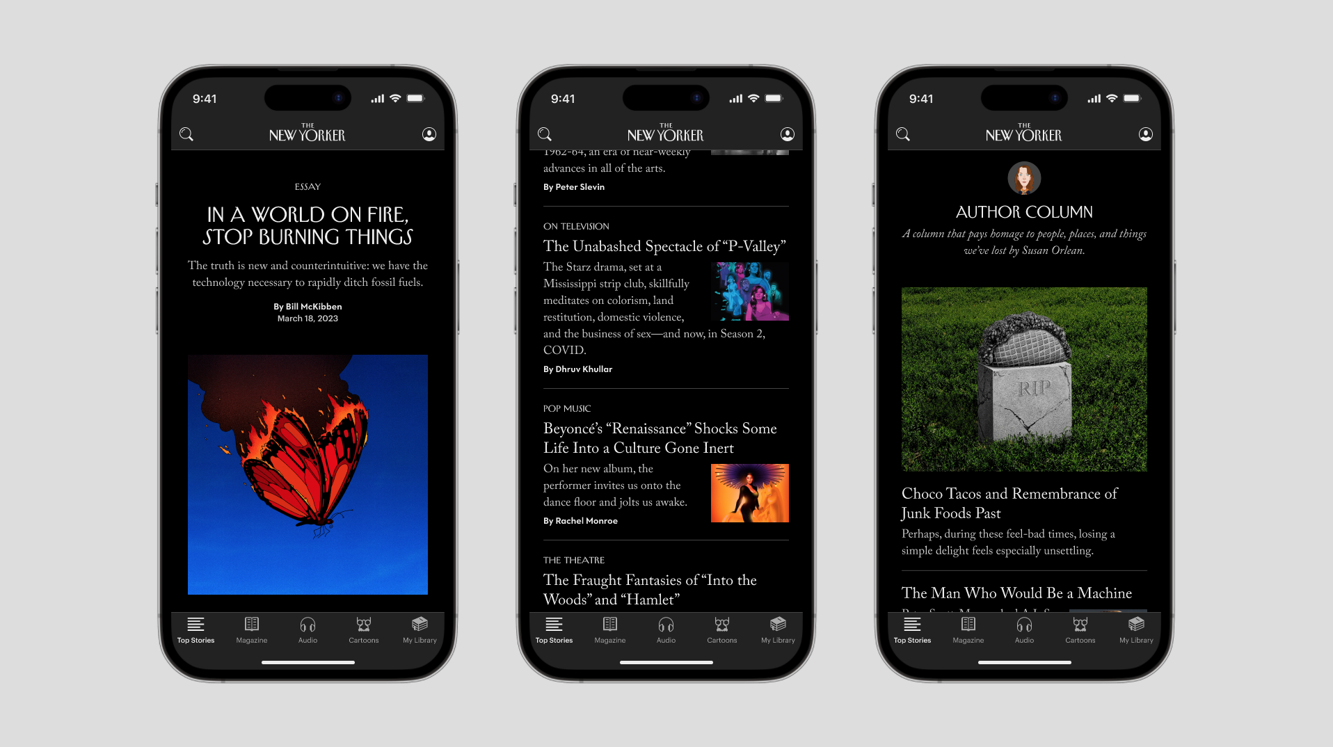
Dark mode experimentation ♟️
We received a significant amount of user feedback regarding the absence of dark mode. With the design system tokens now implemented in Figma and our codebase, we are now able to easily implement it.
With the token system I built in Figma, I can easily experiment with dark mode, bringing the New Yorker app to the dark side...
TEAM
Product Designer - Charlie Carlo
Design Support - Steven Striegel, Danielle Varags
Engineering Support - Sawant Kumar, Arun Kumar
CASE STUDIES
A New Home for AudioProduct Design

The Daily: An Inbox Must-ReadProduct Design
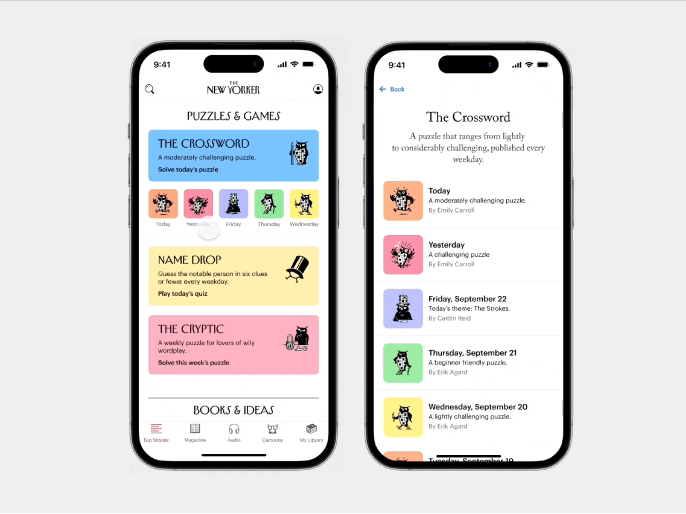
Discovering Puzzles & GamesProduct Design
charlo.design © 2024